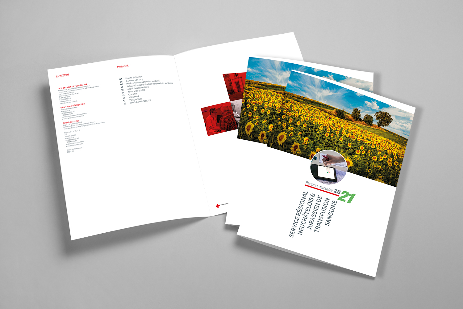
Creation and production of the activity report
of the Neuchâtel
and Jura regional
blood transfusion service
Since 2009, the SRNJTS has mandated me each year to produce its activity report.
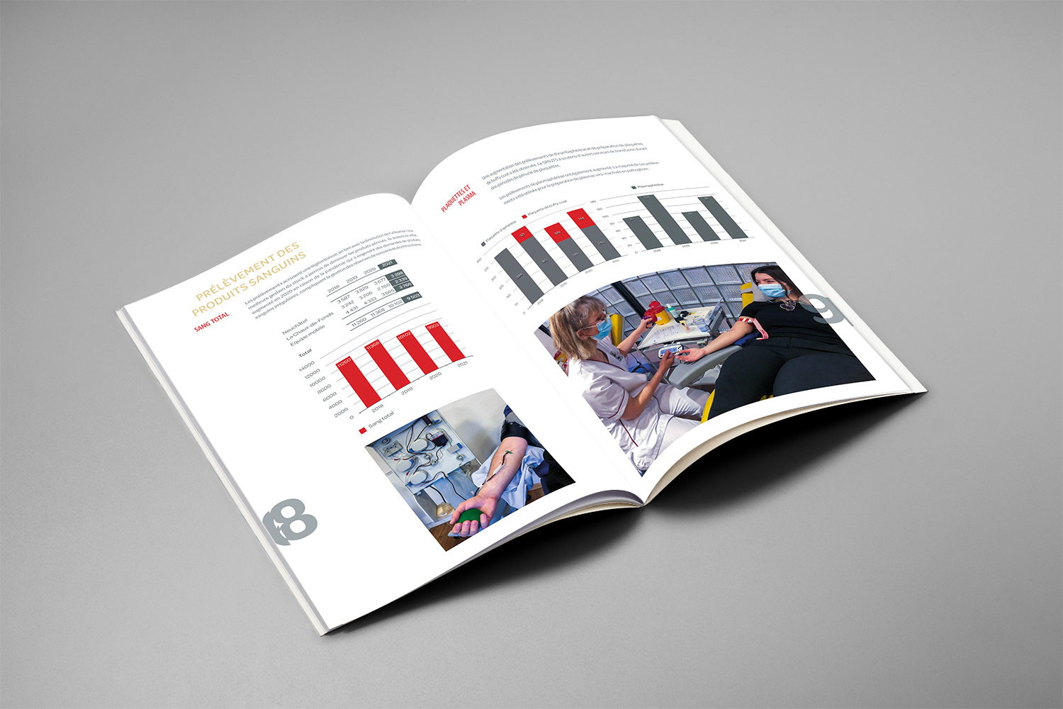
This contains in principle about twenty pages including text, tables and photographs to be laid out.
The texts as well as the tables are provided to me in Word and the photos in RGB JPEG mode.
Having produced a model of intention including the choice of fonts for titles, subtitles, running text as well as the search for colors, the photos received are processed in Photoshop by a colorimetric adjustment, sharpness as well as various color filters. improved visual quality.
They are then put in four-color mode with a resolution of 120 pixels/centimeter at 1/1 scale.
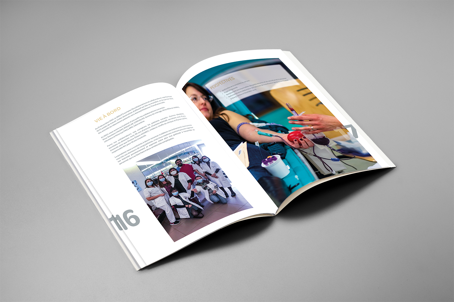
This brochure is supplemented by my own photographs taken mainly during blood donations at mobile blood drives in the Jura Arc or at the fixed blood drive center in La Chaux-de-Fonds.
To contrast with this activity taking place mainly indoors, photos of landscapes taken during my wanderings are laid out randomly.
All my original photos are taken in RAW mode (more efficient and of higher quality than those received in JPEG mode) which allows advanced processing in various software such as Lightroom, Photoshop, DXO PhotoLab and DXO PureRaw.
This activity report is in principle printed digitally in a hundred copies and a downloadable web version is posted on the SRNJTS website.
impression
> Digital four-color front
> Digital four-color back
> Format 210 x 297 mm
paper
> Blanket Profibul 1.1 matt coated, extra white, woodfree, 250 gm² FSC Mix
> Interior Profibul 1.1 matt coated, extra white, woodfree, 150 gm² FSC Mix
design and creation of the website
marcduvillard.ch
Having become Coach Developer (CoDe) after a career as a professional footballer and then a coach, Marc Duvillard entrusted me with the design and creation of his website.
The mandate was to condense his rich professional football experience while emphasizing the new services offered by a CoDe.
In fact, we have agreed to design a so-called "showcase" site containing all the information necessary for people interested in what Marc Duvillard has to offer.
With a "one-page" design, interspersed with different paragraphs and quotations, it is possible at the bottom of the page to download various essential documents to understand the CoDe approach as well as Marc Duvillard curriculum.
To view my work, click here
conception
> Adobe Muse CC software
> Image processing with Adobe Photoshop
> Image Library with Adobe Lightroom
> Vector illustrations with Adobe Illustrator
webmaster
> Publication on Swisscenter company server
> Site management with Transmit software
Creation and production of stencil texts
I received a somewhat special request from a principal, that of applying different texts to the walls of the vaulted passage of the main entrance of his residence.
According to the texts received, I started by looking for the typeface as well as the choice of color that best illustrated the subject.
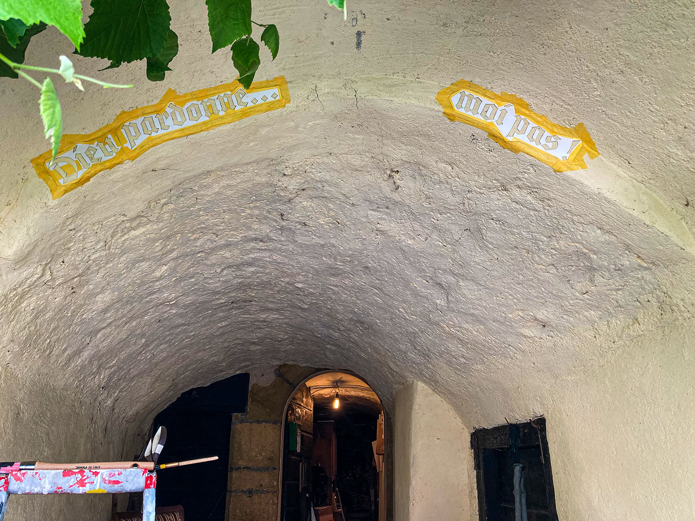
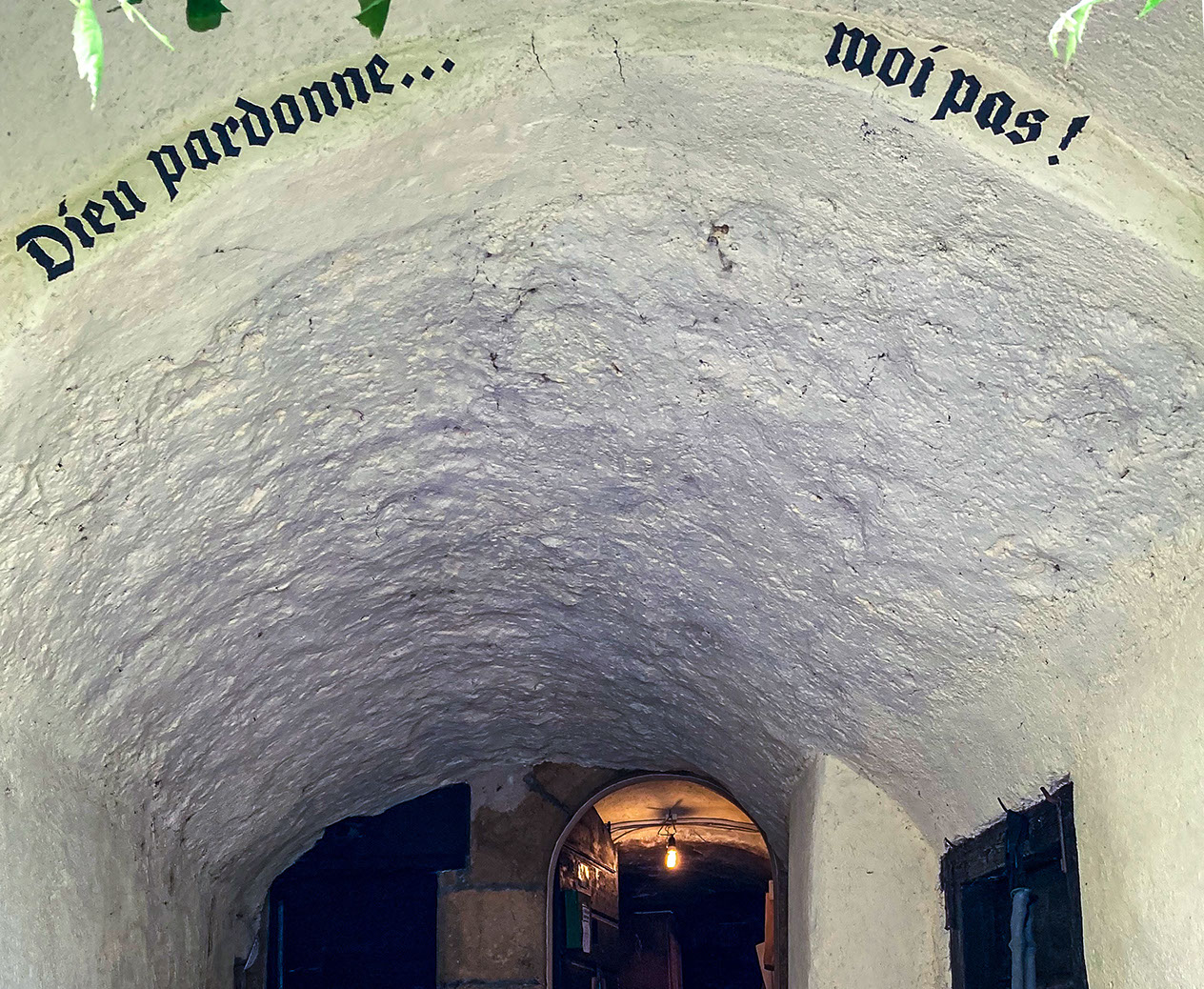
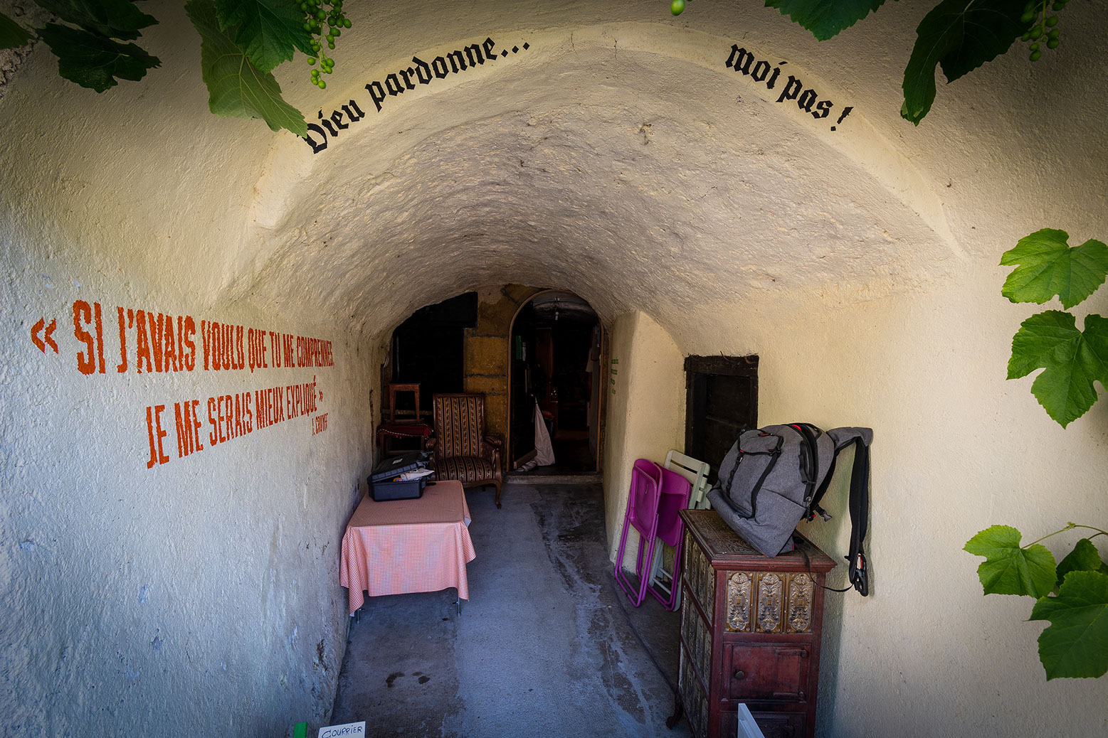
A small frieze at the entrance to the vault has found the perfect place to receive the text “Gods forgive…, me not”.
This text with a religious connotation is actually the title of an Italian western directed by Giuseppe Colizzi and released in 1967.
In the main roles, actors Terence Hill and Bud Spencer (also Italians) share the bill.
A Gothic style calligraphy in black is a nod to ancient biblical texts.
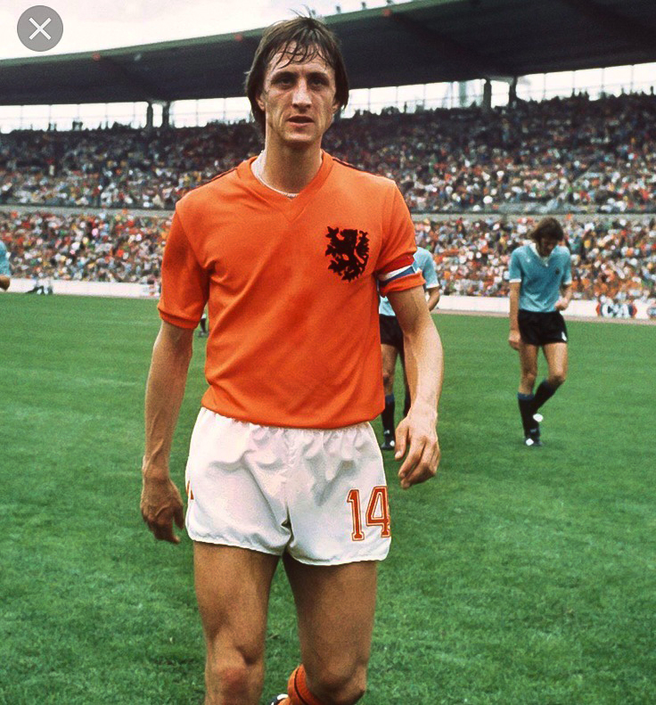
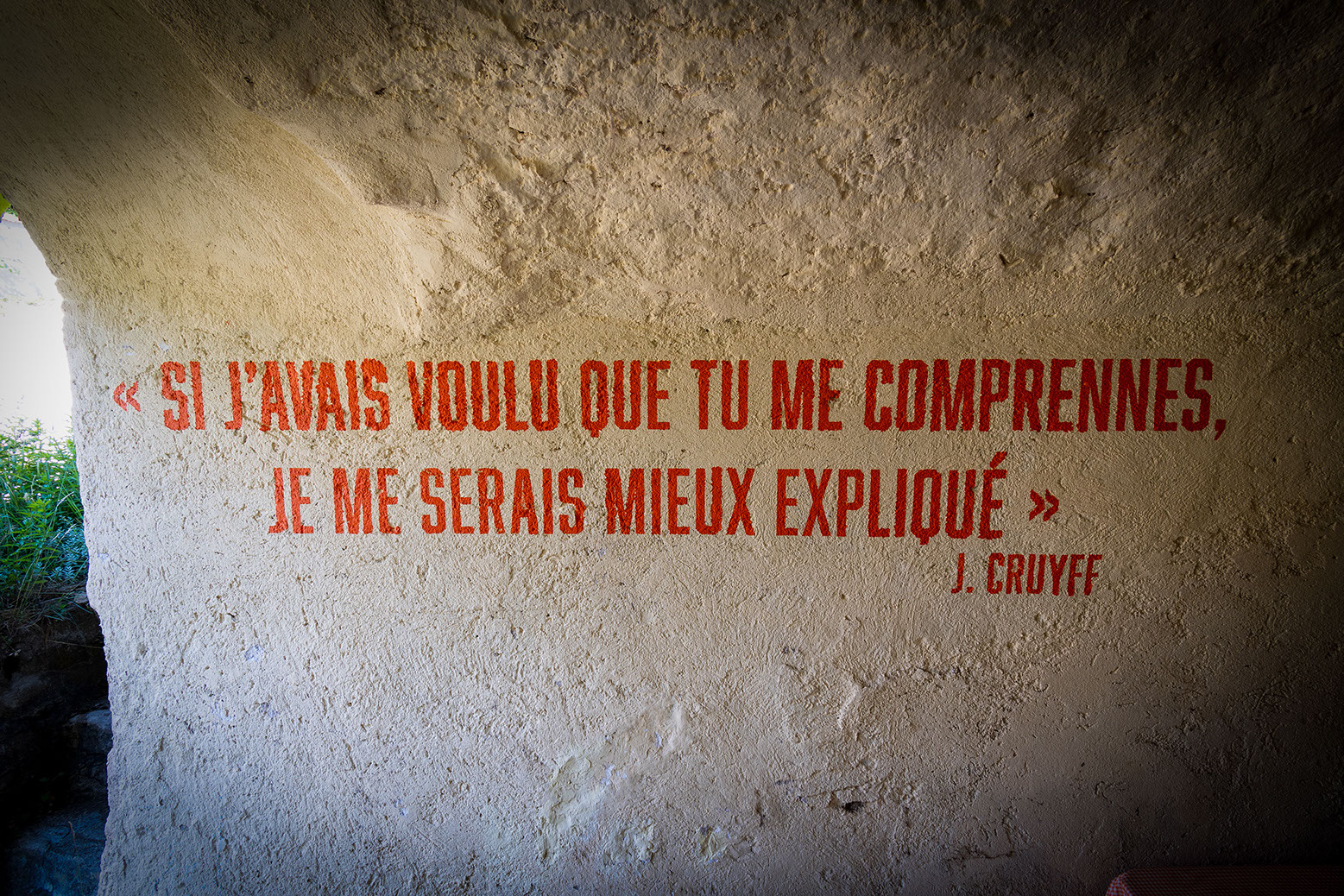
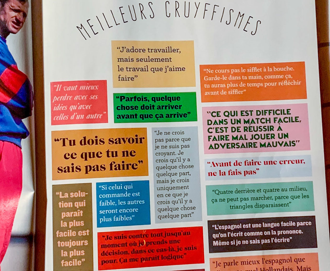
The quote "IF I HAD WANTED YOU TO UNDERSTAND ME, I WOULD HAVE EXPLAINED MYSELF" comes from the famous "Cruyffismes", phrases by Johan Cruyff, Dutch footballer (1947-2016).
Referring to the text “Gods forgive…”, it is a form of response to possible requests for justifications.
Painted in orange (the color of the Dutch football team's jersey) on the left wall, it gives a perspective of depth inviting people to step forward.
The typeface used is that of certain flourishing slogans on the walls of major European capitals!
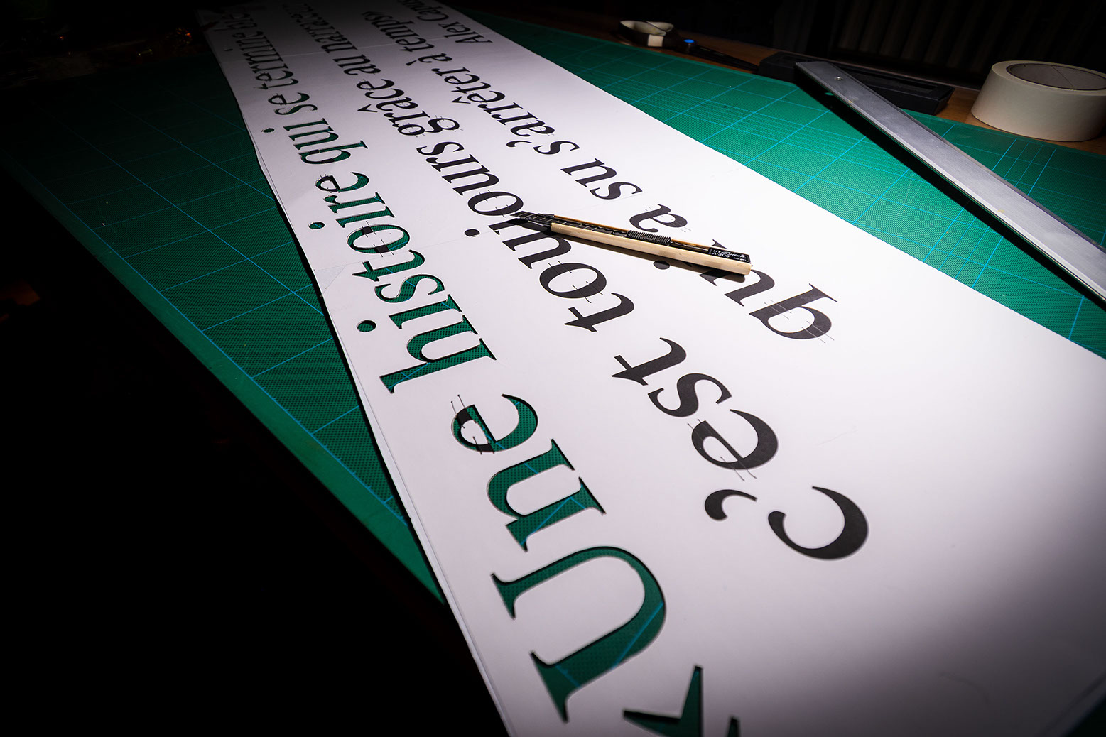
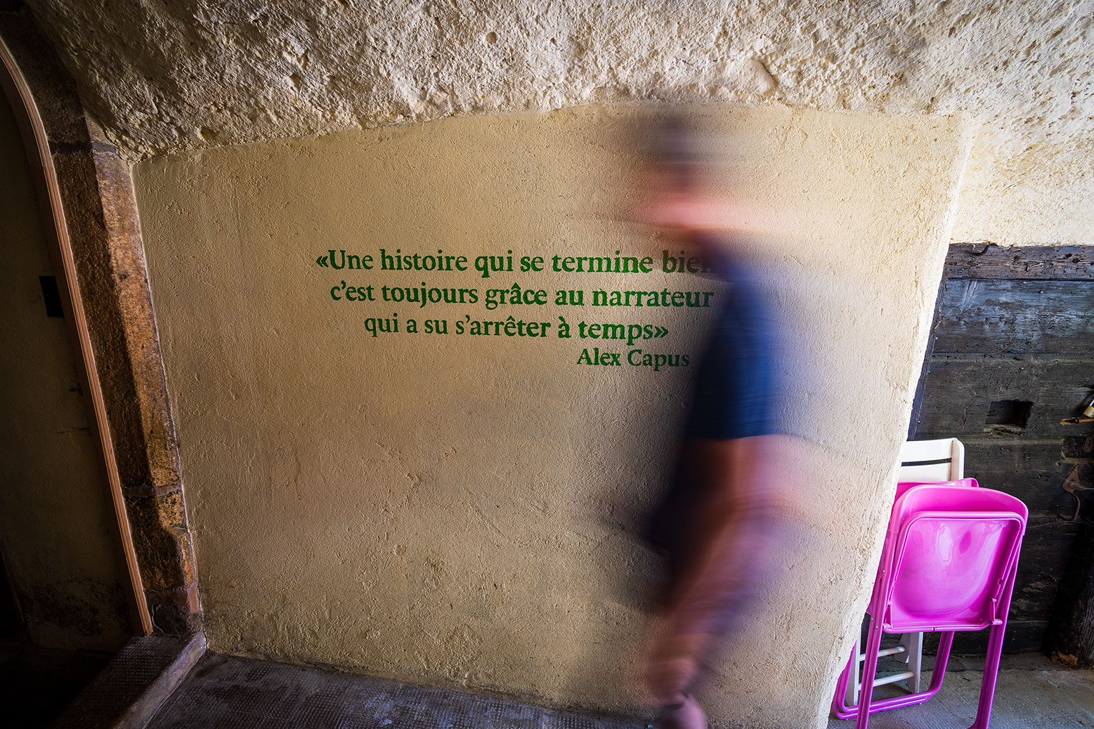
The excerpt from the text by Alex Capus comes from the book “Les amants de Montreuil”.
Unlike the “Cruyffismes”, this one wants to be intellectual, more thoughtful, mature.
The typeface used is found in the world of publishing and more particularly that of books.
Green, in opposition to orange, a hot/cold contrast, brings us calmly to the front door.
The technique used is that of stencil.
The text, composed on a computer on a 1/1 scale and then printed on several A3 and A3+ sheets, is glued to a thin cardboard to then be cut out manually.
TECHNICAL
> Stencil texts painted on walls
Cutting material
> A3+ paper
> Working cardboard, 350 g.
> 3M Repositionable Glue
> Cutter A-300
production
> Maskin Precision 50mm
> Long hair and foam roller
> Round brush
> Spirit level
Paint
> Exponit*** GT3, GT4 and GT5
> RAL 9004 (signal black)
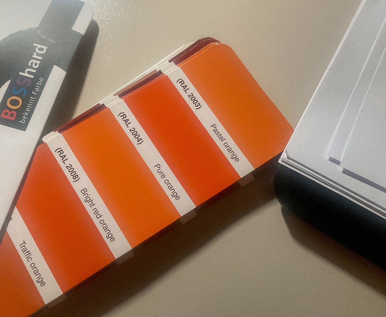
> RAL 2004 (pure orange)
> RAL 6018 (Yellow Green)